
Fix Underperforming Slides So Investors Finish the Deck
Learn how to fix underperforming slides and boost investor engagement. Target data-driven insights to keep your audience interested.
August 17, 2026 · 11 min read

A slide is underperforming when the data shows it, not when it feels off. Run a rapid triage: pull per-slide dwell time, completion rate, and drop-off spikes from your raise room, find the one or two slides where investors actually leave, and fix only those before you send anything else. That single move stops most drop-offs within 72 hours because it targets the exact point where attention dies instead of rewriting a deck that mostly works.
The math behind this is not guesswork. Investors spend an average of 3 minutes and 44 seconds on a first read, and the first three slides act as a filter that decides whether the rest gets read at all. If cover, problem, or solution loses people, the rest of the deck may not be read. A room built on BabyLoveRaise surfaces exactly where that loss happens, slide by slide, instead of leaving you to guess from silence.
Here’s what to do in the next three days:
- Find the biggest drop-off spike. Pull your engagement report and identify the single slide where the largest share of viewers stop scrolling or close the deck.
- Cut the densest slide down to one idea. Move supporting detail, footnotes, and secondary metrics to an appendix; keep the main slide to one claim.
- Turn every title into a conclusion. “Market” becomes “$4B beachhead in mid-market logistics.” A label tells investors nothing; a takeaway tells them what to remember.
Quick fact: decks read for longer sessions convert to meetings at a meaningfully higher rate than decks that get closed early, which is exactly why fixing the slide that causes an early exit outranks polishing slides nobody reaches.
Key Takeaways
Fixing underperforming slides works because it targets the exact point where investor attention breaks, verified by data, rather than guessing at a full redesign.
| Point | Details |
|---|---|
| Triage by impact and effort | Fix slides blocking the first-three filter before touching team, financials, or the ask. |
| Make headlines conclusions | Replace topic labels with one-sentence takeaways to cut cognitive load on every slide. |
| Test before you trust it | Run staggered A/B sends and wait for 20 to 30 views per variant before deciding a fix worked. |
| Match follow-ups to engagement states | Treat dropped, forwarded, and repeat-open signals as different outreach triggers, not one generic nudge. |
| Use a raise room for real signal | BabyLoveRaise turns per-slide dwell and engagement states into a concrete map of which slides to fix next. |
Table of Contents
- How to Read Per-Slide Engagement Data Correctly
- Which Slides to Fix First: An Impact vs. Effort Matrix
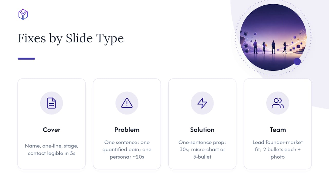
- Exact Fixes by Slide Type
- How to Test Slide Fixes Before You Trust Them
- Turning Engagement States Into Smarter Follow-Ups
- Why Slides Actually Lose Attention (And How to Avoid Misreading Data)
- What Time-Per-Slide Benchmarks Actually Tell You
- What We’ve Learned Fixing Decks Across Hundreds of Raises
- Fix Underperforming Slides Faster With a Raise Room
- Sources
How to Read Per-Slide Engagement Data Correctly
Raw numbers lie if you read them without context. Four metrics matter, and each tells you something different about investor behavior.
Dwell time is how long a viewer sits on a given slide. Completion rate is the percentage of openers who reach that slide at all. A drop-off spike marks the exact slide where people stop and exit rather than continuing. Repeat opens and internal forwards are engagement signals that show interest beyond the first read.
None of these numbers mean much in isolation. A slide with high dwell and low completion rate might be genuinely confusing, or it might just be the slide right after a drop-off cliff, inflating the average because only your most patient readers make it there. Multiply dwell by completion rate to get a real sense of total attention a slide receives, not just attention among survivors.
| Metric | What it tells you | Common misread |
|---|---|---|
| Dwell time | How long attention lingers | High dwell can mean confusion, not interest |
| Completion rate | Who reached this slide | Low rate upstream distorts everything downstream |
| Drop-off spike | Where viewers exit | One outlier investor can look like a trend |
| Repeat opens / forwards | Depth of interest | Silence looks identical to disinterest without this data |
- Treat repeat opens and forwards as warm signals worth a direct follow-up, not just background noise.
- Watch for session fragmentation: a viewer who opens the deck three times on mobile can register as three separate short sessions instead of one long read.
- Set a minimum sample before trusting a pattern. A single investor’s odd behavior is noise, not a finding.
Pro Tip: Never trust a single-viewer data point. Wait until you have at least a handful of opens before deciding a slide is genuinely underperforming rather than a fluke of who happened to read it.
Which Slides to Fix First: An Impact vs. Effort Matrix
Not every weak slide deserves the same urgency. Rank each one by impact, meaning how many viewers reach it and how much it shapes the rest of the read, against effort, meaning how much copy, design, or data cleanup the fix requires.
Slides inside the first three always outrank everything else, because a fix there changes whether people read slide four at all. After that, prioritize team and financials, since these consistently pull the most dwell time in large-sample analyses and reward the extra polish. Traction and ask come next. Anything low-impact and high-effort, like a densely footnoted competitive matrix, belongs in the appendix instead of the main deck.
- Fix anything blocking the cover, problem, or solution sequence before addressing anything else.
- Give team and financials a real editorial pass, not a quick tweak, since they earn the most attention when they’re clear.
- Shorten every weak headline to a single takeaway sentence before redesigning the visual underneath it.
- Convert dense paragraphs into three labeled bullets or a simple chart; that alone often fixes a slow slide without new content.
Exact Fixes by Slide Type
Generic advice like “make it clearer” doesn’t help anyone at midnight before a send. Here’s what actually changes engagement on each slide.
Cover. Name, one-line description, stage, and contact information need to be legible in five seconds. Strip decorative graphics that don’t carry information.
Problem. One sentence, one quantified pain point, one named persona. Investors should read this slide in about 20 seconds; a single customer data point beats three paragraphs of narrative.
Solution. State the value proposition in one sentence with a 30-second readability target. A before/after micro-chart or a three-bullet proof ladder does more work than a feature list.
Team. Lead with founder-market fit. Two relevance bullets per founder, paired with a photo, outperform a resume dump. This slide often earns the most dwell time of the whole deck, so it deserves your sharpest editorial pass.
Financials. Keep it to one page with a labeled assumptions row and your best metric highlighted. Investors want an at-a-glance sanity check on runway, ARR, and growth rate, with detailed model math pushed to the appendix.
Traction and product. Charts need to read clearly at thumbnail size. Lead with the metric headline itself, not buried axis labels or small-font annotations.
Competition and market. Use a scannable matrix and beachhead-first TAM math instead of a planet-sized total addressable market with no credible path to it.
Ask. One line with the dollar amount, followed by bulleted use-of-funds and expected milestones.
Pro Tip: Automated screening tools are now common at funds, and they parse text-based headers and numbers before a human ever opens the file. Write your metrics as plain numerals with clear labels, not buried inside a chart legend, so both a person and a parser can find them.
How to Test Slide Fixes Before You Trust Them
A fix that feels better isn’t the same as a fix that performs better. Run a short experiment before committing to it across every send.
- Send the original deck (variant A) to one matched cohort and the fixed version (variant B) to a similar cohort, staggered by a few days if you can’t split simultaneously.
- Track time-per-slide and completion rate on the specific slide you changed, not the whole deck average.
- Wait for a minimum of 20 to 30 unique views per variant before drawing any directional conclusion; early-stage sample sizes are small, and one investor’s odd browsing habit can skew a three-view sample completely.
- Treat a relative lift above 15% in completion rate, or an increase of 8 to 10 seconds in dwell on the target slide, as a meaningful result worth keeping.
- If the lift is smaller than that, don’t declare victory. Iterate the copy or layout again and re-test rather than assuming the first edit solved it.
Quick fact: cold outreach decks average roughly 2 minutes 31 seconds of read time with weak conversion, while warm-introduction decks average 4 minutes 18 seconds with much stronger conversion. Never compare a cold-send test result against a warm-send benchmark. Keep the cohorts separate or the whole experiment is meaningless.
Turning Engagement States Into Smarter Follow-Ups
The two silences that look identical, “never opened it” and “read everything and left,” require completely different responses. Engagement states tell you which one you’re dealing with.
- Never opened. Don’t resend the same deck with the same subject line. Try a shorter preview line, a different subject, or route through a warm introduction instead.
- Dropped at a specific slide. Reference it directly: “I clarified our TAM math on slide 5, here’s the updated link.” Specificity signals you’re paying attention to their actual behavior, not sending a form email.
- Read everything or opened repeatedly. Treat this as a warm signal and move fast. Send a short ask for a 20-minute call and attach an appendix with more granular numbers, since extended engagement and repeat sessions are among the more reliable predictors of real interest.
- Forwarded internally. This usually means a partner is reviewing it. Send a concise one-pager with supporting evidence and ask what they’d want to see next, rather than resending the full deck.
Why Slides Actually Lose Attention (And How to Avoid Misreading Data)
Three mistakes trip up almost everyone who reads engagement data for the first time. The first is confusing low dwell with irrelevance, when the real cause is often poor labeling that makes a slide easy to skim past without absorbing it. The second is ignoring cohort differences; a slide’s average dwell means something different in a warm cohort than a cold one, and blending them muddies every conclusion. The third is overfitting to a single investor’s quirky reading pattern instead of waiting for a real sample.
The underlying cognitive reasons a slide loses attention are usually simple: information overload, a headline that states a topic instead of a conclusion, or a slide that shows up out of order relative to how investors expect a narrative to unfold. Design amplifies clarity but can’t fix a weak argument underneath it. A beautifully designed slide with a confused thesis still gets skimmed.
- Track document engagement, not investor behavior profiles. The goal is a better deck, not a dossier on any one person.
- Redact unnecessary personal identifiers in your own records and lean on your raise-room platform’s privacy-by-design defaults rather than building a spreadsheet of individual reading habits.
Pro Tip: If a slide has short dwell but high completion rate, that’s usually a good sign, not a bad one. It means the point landed fast and investors moved on with confidence, which is exactly what a strong problem or solution slide should do.
What Time-Per-Slide Benchmarks Actually Tell You
Benchmarks are directional targets, not pass/fail thresholds, but they give you a real anchor when you have no other reference point. Based on large-sample industry analysis of investor reading behavior, here’s roughly what strong decks look like slide by slide.
These figures come from aggregated investor behavior data across many decks, not your specific cohort, so use them as a comparison point rather than a verdict. Adjust for your own deck length: a 10-slide deck should show higher per-slide dwell than an 18-slide deck simply because there’s less material competing for the same 3-minute-44-second window. Always separate warm and cold sends before comparing your numbers to these benchmarks, since the two cohorts read at meaningfully different speeds.
What We’ve Learned Fixing Decks Across Hundreds of Raises
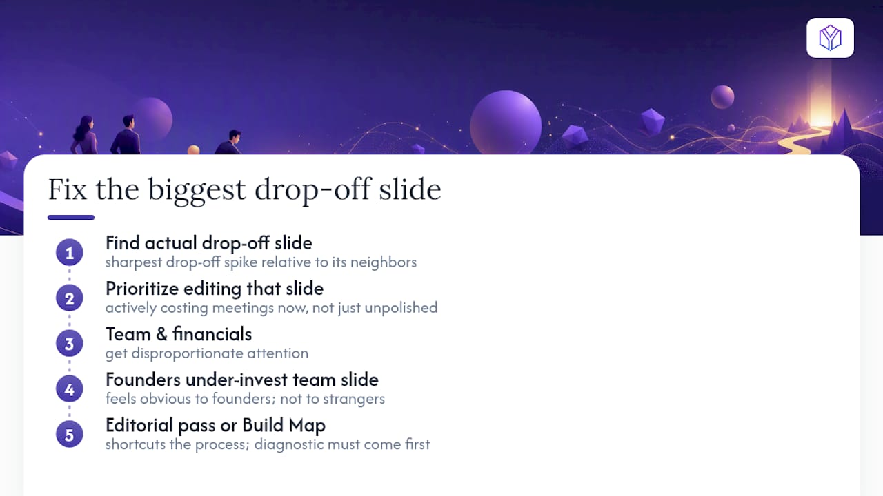
The pattern we see most often isn’t a badly designed deck. It’s a well-designed deck with one or two slides that quietly break the read, usually because the founder wrote the headline as a topic instead of a conclusion. When we prioritize an editorial pass, we start with whichever slide shows the sharpest drop-off spike relative to its neighbors, because that’s the slide actively costing meetings right now, not the slide that merely looks unpolished.
Team and financials get disproportionate attention in almost every raise we watch, which matches what the broader data shows about where investors spend their limited reading budget. Founders often under-invest in the team slide because it feels obvious to them. It isn’t obvious to a stranger deciding whether to trust a founding team with their money.
For founders who want a second pair of eyes rather than doing this alone, an editorial pass or a Build Map narrative artifact can shortcut the process, but the diagnostic step, finding the actual drop-off slide, always has to come first. Guessing which slide is weak and guessing right are two very different things.
Fix Underperforming Slides Faster With a Raise Room
BabyLoveRaise turns your fundraise into a data source instead of a guessing game. Every send generates per-slide dwell, completion rate, and engagement states, so you know within days, not weeks, exactly which slide is costing you meetings.
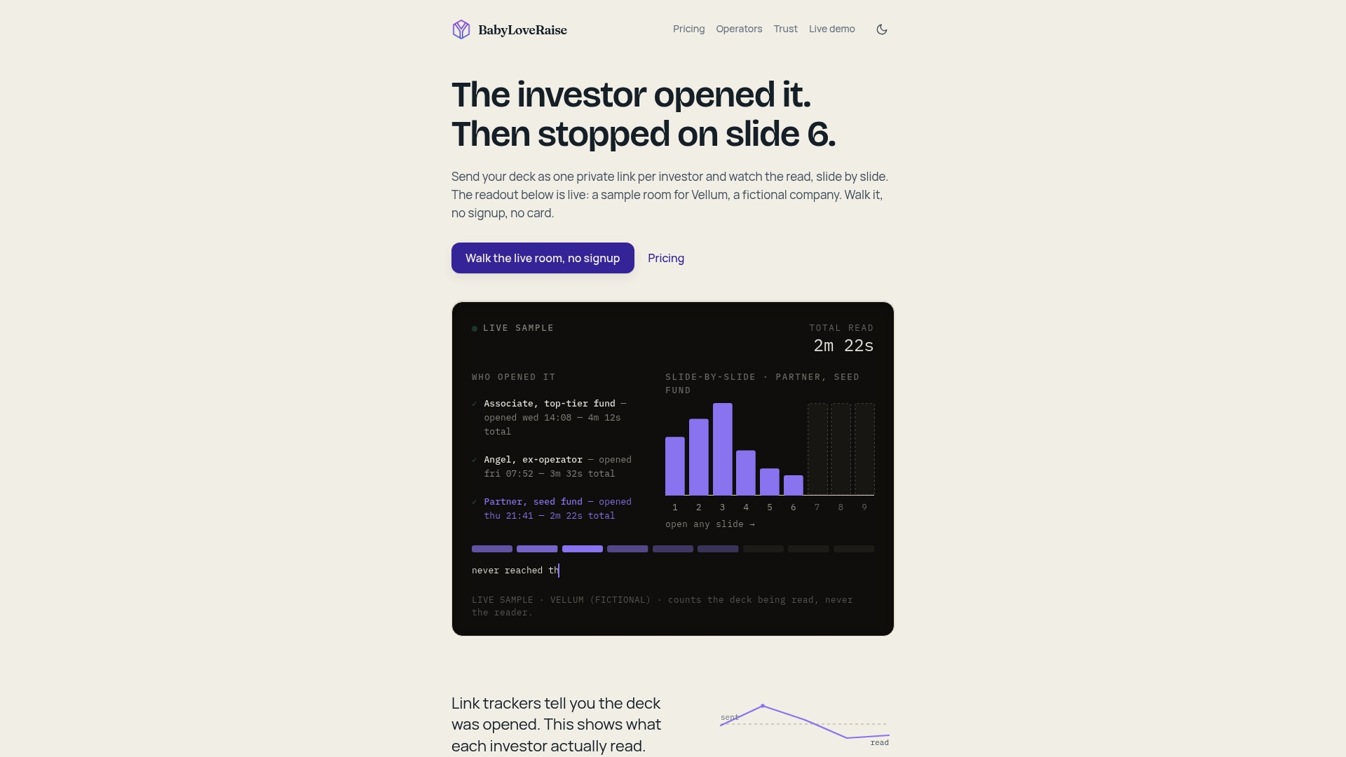
Where a generic file share tells you a link was opened, a BabyLoveRaise room tells you who read to the last slide, who dropped at slide four, and who forwarded the deck internally, turning two identical silences into two different, actionable signals. The platform tracks the document, not the person, following privacy-by-design defaults instead of building behavioral profiles on individual investors. If you’d rather have a second pair of eyes fix the slides once you’ve spotted them, the editorial pass and Build Map options exist for exactly that.
Send your next round through a tracked room, watch where the drop-off actually happens, and fix that slide first. Check pricing and plan options or review the trust and privacy details before your next send.
Sources
- What Investors Actually Read in Your Pitch Deck (DocSend Data) - PitchGrade
- How Investors Read Pitch Decks in Under 3 Minutes — And What That Means for Yours - The Pitch Deck Guide
- How Investors Read a Pitch Deck Before the First Meeting - OGScapital
- How Investors Read Pitch Decks - Deckly Design