
Pitch Deck Strategy for Founders: Win Investor Meetings
Master your pitch deck strategy to secure investor meetings. Learn how to create concise, persuasive slides that grab attention and earn follow-ups.
July 27, 2026 · 24 min read

Your pitch deck has one job: earn the next conversation. Not close the round, not answer every diligence question, not prove you’ve thought of everything. Just get the meeting. The founders who internalize that distinction build decks that are persuasive filters, not business plans in slide form. A concise slide deck with about 10–12 slides is standard for investor emails or cold outreach; a smaller set of focused 5–7 slides works well for demo day or short intro calls; a longer version with an appendix suits leave-behinds after live meetings. The slide sequence that covers the essentials runs: Cover → Problem → Solution → Why Now → Product → GTM/Traction → Market → Business Model → Competition → Team → Ask.
Table of Contents
- What does each slide in your pitch deck need to accomplish?
- How do you build a narrative that makes investors believe you?
- What design rules keep investors reading past slide three?
- What do investors actually want to see on your GTM slide?
- What should you cut before sending the deck?
- Which pitch deck template fits your stage and situation?
- How should your deck change from pre-seed to Series A?
- How do you rehearse, present, and follow up effectively?
- How does a raise room help you iterate and prioritize follow-ups?
- How do you make your pitch emotionally compelling, not just logically sound?
- How should early-stage startups handle financial projections?
- How do you address competition without looking defensive?
- How do you update the deck after investor feedback?
- What questions will investors ask, slide by slide?
- How do you research investors before tailoring your deck?
- Key Takeaways
- What a deck-ready pitch actually looks like
- BabyLoveRaise turns your raise room into a feedback engine
- Sources and templates referenced in this guide
What does each slide in your pitch deck need to accomplish?
Think of each slide as a single argument, not a summary. If a slide makes more than one claim, it’s doing too much.
- Cover: One-line company description plus a traction or value claim. The investor should know what you do and why it matters before they click to slide two.
- Problem: Name a specific customer pain and quantify it. Cost, time lost, or a broken experience. Vague problems produce vague interest.
- Solution: One sentence on what the product does and the core mechanism of value. Resist the urge to list features.
- Why Now: The market shift, regulatory change, or technology unlock that makes this moment the right one. Without this slide, investors wonder why nobody built it before.
- Product/Demo: One clear image, screenshot, or metric that proves the thing works. Not a feature tour.
- GTM/Traction: Current channels driving revenue, conversion funnel metrics, and how the raise accelerates what’s already working.
- Market: TAM/SAM/SOM headline with one or two derivation bullets. Put the full model in the appendix.
- Business Model + Unit Economics: Headline metrics and key assumptions. How you make money per unit, not just in aggregate.
- Competition/Alternatives: Honest axes that show where you win. Use generic category labels, not competitor names, to keep the slide clean.
- Team: One or two credentials per person that are directly relevant to execution. Not a LinkedIn summary.
- Ask: How much you’re raising, what it funds, and the milestones the money unlocks. End on the decision you want them to make.
Pro Tip: Write the headline of each slide as a complete sentence that states a claim, not a label. “Problem” is a label. “Restaurants lose 23% of revenue to no-shows with no real-time solution” is a claim. Claims are what investors remember.
How do you build a narrative that makes investors believe you?
The most common reason a deck fails isn’t bad design or weak numbers. It’s a logic gap between the problem and solution: the founder shows a real problem, then jumps to their product without explaining why previous solutions failed or why now is the right moment. Investors fill that gap with skepticism.

Narrative strategists identify slide order as the mechanism of inevitability. Each slide should create the need for the next, so that by the time you reach the ask, the investor has already reasoned their way to “yes” and you’re just confirming the number.
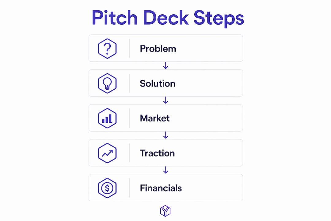
Pick a primary framework based on your strongest signal. The five that consistently produce coherent investor narratives are PAS (Problem-Agitate-Solution), Why-How-What, BAB (Before-After-Bridge), Hero’s Journey, and the YC memo style. A review of 1,000+ decks found that many strong decks mix frameworks across slides rather than rigidly applying one. PAS works well when the pain is visceral and quantifiable. The YC memo style works when traction is your strongest card. BAB works when the contrast between the old world and the new one is dramatic.
Closing the logic gap in practice. Here’s what a weak problem-to-solution jump looks like versus a tight one:
Weak: “Restaurants lose revenue to no-shows. We built a reservation management platform.”
Tight: “Restaurants lose 23% of revenue to no-shows. Existing tools send reminders but can’t reprice or resell the slot in real time. We built a dynamic slot marketplace that fills canceled tables within 90 minutes.”
The tight version answers “why now” (real-time repricing is newly possible), explains why previous solutions fail (reminders don’t recover revenue), and makes the solution feel inevitable.
Pro Tip: On your GTM and unit-economics slides, make assumptions explicit in bullet form. Show the math in three lines. Investors who can follow your logic without asking are investors who stay engaged.
What design rules keep investors reading past slide three?
Design serves the argument. A deck that looks polished but buries the point is worse than a plain deck that states it clearly, because the polish signals that the founder prioritized aesthetics over thinking.
The practical rules that matter most:
- Grid and whitespace: Use a consistent grid. High-performing decks anchor the key insight on the left and supporting visual evidence on the right, following the rule of thirds. Generous whitespace isn’t wasted space; it’s what makes a slide readable at a glance.
- Typography: Two typefaces maximum. One for headlines, one for body. Use large type (28pt+ for headlines, 18pt+ for body). If a slide requires 12pt text to fit the content, the content is the problem.
- Charts: One chart per slide. Label axes. Annotate inflection points with a short caption explaining what caused the change. Remove gridlines, legends that duplicate axis labels, and any element that doesn’t carry the argument.
- Color: A minimal palette of two or three colors. Use a single accent color to direct attention. Avoid gradients and drop shadows.
What to avoid:
- Screenshots that are too small to read
- Bullet lists that run more than four items
- Slide titles that are labels instead of claims
- Inconsistent margins between slides (it signals a rushed deck)
Pro Tip: Before you finalize the deck, print each slide at thumbnail size (about 2 inches wide). If you can’t read the headline and identify the main visual at that size, the slide fails the investor’s first-glance test.
What do investors actually want to see on your GTM slide?
The GTM slide is where most decks lose credibility fast. Founders list every channel they plan to use. Investors read that as a wish list and move on.

A winning GTM slide shows existing traction first, then a clear plan for how the raise accelerates the motions that already work. The structure is: here’s what’s driving revenue now, here’s the unit economics of that motion, and here’s what happens to those metrics when we add capital.
Required traction metrics to include:
| Metric | Why it matters | What to show |
|---|---|---|
| ARR or MRR | Proves revenue reality | Current figure + MoM growth rate |
| CAC | Shows acquisition efficiency | By channel, not blended |
| LTV or gross margin per unit | Proves the model works at unit level | With payback period |
| Churn | Signals retention and product-market fit | Monthly, not annual |
| CAC payback period | Tells investors when they get their money back | In months |
How to present assumptions without losing the room. Show the math in three to five bullets on the slide itself. Put the full model in the appendix. Highlight the one or two levers that drive the projection most, because that’s what investors will ask about. If your CAC payback is 14 months and your model assumes it drops to 8 months at scale, say what drives that drop.
Pro Tip: Show existing channel unit economics and a realistic path to scale instead of a list of channels you haven’t tested. One channel with a 3x LTV:CAC ratio is more persuasive than six channels with no data.
What should you cut before sending the deck?
The fastest way to improve a deck is subtraction. Most first drafts have at least three slides that are doing nothing useful.
Red flags investors notice immediately:
- Overloaded slides with more than one main claim
- GTM slides that list channels without traction data
- Financial projections with no stated assumptions
- Screenshots too small to read
- Feature lists instead of outcome statements
- Numbers that don’t reconcile across slides (e.g., revenue on the traction slide doesn’t match the model slide)
Quick triage checklist:
- Does every slide have exactly one headline claim?
- Do the numbers on the traction slide match the numbers on the model slide?
- Is anything in the body of the deck that belongs in an appendix? (Full financial models, detailed org charts, long customer lists)
- Are there any slides that could be removed without breaking the argument? If yes, remove them.
- Does the ask slide state a specific amount, specific milestones, and a specific next round or profitability target?
Before/after example on the ask slide:
Before: “We’re raising $1.5M for 18 months of runway.”
After: “We’re raising $1.5M to reach $2M ARR and three enterprise reference customers, the threshold our Series A conversations require.”
The second version tells investors what their money buys and what the company looks like when it’s spent. That specificity is what makes it credible.
Which pitch deck template fits your stage and situation?
No template is universally right. The right one depends on your stage, your strongest signal, and whether the deck is going into an email or a live meeting.
Named templates worth studying:
- Sequoia Capital pitch deck template: Sequoia’s internal framework follows a tight narrative sequence: company purpose, problem, solution, why now, market size, product, business model, team, financials, and competition. It’s minimal by design and works best for founders who have a clear thesis and early traction. Study it for its sequencing logic, not its visual style.
- Y Combinator (YC) pitch deck template: YC guidance emphasizes 5–7 core ideas, legibility, and simplicity. The YC memo style works especially well for demo day and early seed rounds where the founder’s credibility and the problem clarity carry more weight than financial depth.
- Slidebean templates: Slidebean offers pre-built deck structures with design already applied. Useful for founders who need a professional-looking starting point quickly. The risk is that the template’s visual choices can override the argument’s logic. Use it as a scaffold, then rebuild the slide order around your narrative.
- Figma pitch deck templates: Figma’s community templates give designers and design-minded founders full control over layout. The advantage is pixel-level precision; the disadvantage is that it requires design skill to use well. Best for Series A decks where visual polish matters more.
For pitch deck examples that show how these frameworks translate to funded companies, studying real decks is more instructive than any template.
Template comparison by stage and purpose:
| Template style | Best for | Slide count | Design style | Primary purpose | Downloadable |
|---|---|---|---|---|---|
| Minimal investor intro (Sequoia-style) | Pre-seed, seed | 10–12 | Minimal, text-led | Investor email intro | Yes (PDF) |
| Memo-style (YC) | Demo day, early seed | 5–7 | Plain, legible | Live presentation | Yes (PDF) |
| Visual storytelling (Slidebean) | Seed, Series A | 12–15 | Visual-heavy | Email + live hybrid | Yes (template) |
| Design-first (Figma) | Series A+ | 12–18 | Polished, branded | Leave-behind | Yes (Figma file) |
How should your deck change from pre-seed to Series A?
Stage determines emphasis. A pre-seed deck that leads with financial projections signals that the founder doesn’t understand what investors need at that stage. A Series A deck that leads with founder story and skips unit economics signals the same thing, just in the other direction.
Pre-seed: The investor is betting on the founder and the problem. Lead with:
- A specific, well-researched problem with quantified pain
- Founder credentials directly relevant to solving it
- Concept validation: early customer conversations, letters of intent, or a working prototype
- A clear thesis on why now
Acceptable evidence at pre-seed: letters of intent, pilot agreements, waitlist signups with conversion data, or a working MVP with a handful of paying users.
Seed: The investor wants to see that something is working and can be repeated. Front-load:
- Early traction: MRR, paying customer count, or pilot results
- A repeatable GTM channel with unit economics (even rough ones)
- Initial cohort data showing retention
- A clear use of funds tied to specific milestones
Acceptable evidence at seed: three to six months of MRR growth, a CAC and LTV estimate by channel, and at least one cohort with measurable retention.
Series A: The investor is evaluating whether the company can scale. Lead with:
- Proven growth: ARR trajectory, growth rate, and net revenue retention
- Funnel metrics showing the sales motion is repeatable
- Unit economics stability across cohorts
- A clear plan to scale sales operations with the raise
At Series A, “we’re growing fast” is not enough. Investors want to see that the growth is efficient, that the model holds at scale, and that the team has the operational depth to execute.
How do you rehearse, present, and follow up effectively?
The deck gets you in the room. What happens in the room is a different skill.
Rehearsal checklist:
- Time each slide. Aim for 60–90 seconds per slide in a live meeting, 30–45 seconds for demo day.
- Write one sentence per slide that you’ll say aloud as the headline. Practice saying it without looking at the slide.
- Run the full deck with a practice partner who has permission to interrupt and ask hard questions.
- Test narrative momentum: can you explain the whole pitch as a conversation, without slides, in under five minutes?
Presentation timing by format:
- Intro meeting (30 minutes): plan for 12–15 minutes of deck, 15 minutes of Q&A. Never run the deck to the end of the meeting.
- Demo day (3–5 minutes): 5–7 slides maximum, no Q&A during the pitch. Every word counts.
- VC office hours (60 minutes): use the deck as a reference, not a script. Be ready to jump to any slide on request.
Follow-up workflow. Send the follow-up email within 24 hours of the meeting. Attach or link the leave-behind version of the deck (the annotated version, not the live presentation). Reference one specific thing from the conversation to show you were listening. State a clear next step: a follow-up call, a data room link, or a specific question you’ll answer in writing.
Maintain two deck versions: a clean presentation file for live meetings and a slightly annotated version for asynchronous reads. Editing both simultaneously produces a deck that’s too thin for email or too dense for live presentation.
Pro Tip: In the follow-up email, reference the slide that generated the most discussion. It signals you paid attention and gives the investor a hook to forward your deck internally with context.
How does a raise room help you iterate and prioritize follow-ups?
Sending a deck by email and waiting is the worst possible feedback loop. You don’t know if the investor opened it, which slides they read, or where they stopped. Two investors who both “went quiet” could be in completely different states: one never opened the deck, one read every slide and passed. Without data, you treat them identically, which means you follow up with the wrong urgency and revise the wrong slides.
A raise room solves this. BabyLoveRaise gives founders a hosted link that records per-slide engagement: who opened the deck, how long they spent on each slide, and where attention dropped. The dashboard turns silence into signal.
Key features and use cases:
- Open/read notifications: Know the moment an investor opens the deck. First-read timing tells you a lot about priority.
- Per-slide dwell time: Identify which slides hold attention and which get skimmed. A slide with 8 seconds of average dwell time is a slide to redesign.
- Engagement-based follow-up triage: Prioritize investors who read to the ask slide. Deprioritize those who dropped off at slide three.
- Version control: Send an updated deck to investors who dropped off early, with a short note explaining what changed.
- Share link registers: First-send links, forwardable links, and private links give you control over who sees what version.
Privacy and ethics. BabyLoveRaise’s approach is document-level analytics, not per-investor profiling. The platform tracks the document, not the person, which means you get the engagement signal without building a surveillance dossier on individual investors. You can be transparent with investors about the fact that you use a raise room; most sophisticated investors expect it.
Workflow:
- Upload the deck and create a raise room.
- Send the room link to your investor list.
- Monitor the dashboard for opens and per-slide engagement.
- Follow up with investors who read the full deck within 48 hours.
- Identify slides with high drop-off and revise them.
- Send the updated deck to investors who dropped off early, with a targeted note.
Pro Tip: Use per-slide dwell data as a proxy for the co-founder read you don’t have. If your competition slide gets 6 seconds and your traction slide gets 45 seconds, you know which one is working and which one needs a rewrite.
How do you make your pitch emotionally compelling, not just logically sound?
Data convinces. Story compels. The most effective pitches do both, and the order matters: personal narrative first, data second. Investors need evidence for the problem, scalability, and market fit, but it’s the personal narrative that makes a pitch memorable.
The founders who get this wrong lead with market size and financial projections, then add their story as an afterthought. The founders who get it right open with the moment the problem became real for them, then use data to validate what the story already made the investor feel.
Three techniques that work beyond basic narrative structure:
Start with the “why” moment. Share the specific experience that made the problem impossible to ignore. Not a general observation about the market. A specific moment, a specific person, a specific failure. That specificity is what creates emotional resonance.
Make the pitch conversational. Founders who treat the pitch as a script disengage their audience. Founders who treat it as a five-minute conversation with a smart friend stay present, respond to the room, and come across as someone worth betting on. Practice until you can explain the entire pitch without slides.
Bring your energy into the room. Investors don’t just invest in businesses; they invest in people who can execute under pressure. Your energy, conviction, and calm under hard questions are part of the pitch. A founder who deflects a tough question reads as fragile. A founder who engages it directly reads as someone who’s already thought it through.
How should early-stage startups handle financial projections?
The fastest way to lose a sophisticated investor is a financial slide that can’t survive a single question. Numbers in a deck are summaries of a model, and the model has to exist in a spreadsheet with every figure traceable to a cell you can defend.
For early-stage startups, the goal isn’t to show a hockey-stick curve. It’s to show that you understand your unit economics and can build a credible driver-based model.
What to include at each stage:
At pre-seed, show a simple revenue model with stated assumptions: price per unit, estimated conversion rate, and a 12–18 month projection. Don’t project five years of revenue when you have three months of data.
At seed, show 18–24 months of projections with explicit assumptions for CAC, LTV, churn, and growth rate. Tie the projections to your GTM motion. If your model assumes 40% MoM growth, state what drives that.
At Series A, show a three-year model with annual cohort data, unit economics by channel, and a clear path to profitability or the next round. The model should be able to answer “what would have to be true?” for every major assumption.
One rule that applies at every stage: the amount you’re raising should map to specific milestones, and those milestones should map to the next round or profitability. “We’re raising $2M for 18 months of runway” is a burn rate. “We’re raising $2M to reach $3M ARR and two enterprise reference customers, which positions us for a Series A” is a plan.
How do you address competition without looking defensive?
The worst competition slide is a 2x2 matrix where you’re in the top-right corner and everyone else is in the bottom-left. Investors have seen it thousands of times and it signals that you haven’t thought carefully about the competitive landscape.
The best competition slide does three things: it acknowledges that alternatives exist, it shows the specific axes where you win, and it explains why those axes matter to the customer.
How to frame it:
Use generic category labels instead of competitor names where possible. “Enterprise CRM platforms” and “spreadsheet-based workflows” are more honest and less defensive than naming specific companies. Then show the two or three dimensions where your solution is genuinely differentiated: speed, price, integration depth, vertical focus, or a specific workflow capability.
State your differentiation as a customer outcome, not a feature. “We close the loop in 90 minutes; existing tools take 24 hours” is a differentiation claim. “We have a real-time API” is a feature claim. Investors care about the outcome.
What to include in the appendix: If you have a detailed competitive analysis with feature matrices, put it there. Investors who want to dig in will ask. Putting it in the body of the deck signals that you’re not confident the differentiation is obvious.
How do you update the deck after investor feedback?
Most founders treat the pitch deck as a document they finish once. The founders who close rounds treat it as a living artifact they update after every conversation.
A practical iteration workflow:
After each investor meeting, write down the three questions that came up most. If the same question appears in three consecutive meetings, that’s a slide problem, not a conversation problem. The slide isn’t making the answer obvious.
Prioritize revisions by impact: slides that generate confusion or skepticism get fixed first. Slides that generate good questions (the kind that signal engagement) get left alone.
When you update the deck, version it. Keep the previous version accessible. If you’re using a raise room, send the updated version to investors who dropped off early with a short note: “We updated the GTM slide based on feedback from our last few conversations. Happy to walk you through what changed.”
What not to change after every meeting: Don’t revise the narrative arc based on one investor’s preference. Some investors will want more financial detail; others will want less. The deck should serve the majority of your target investors, not the most recent one. Use due diligence documents to satisfy investors who want depth beyond the deck.
What questions will investors ask, slide by slide?
Anticipating investor questions is a rehearsal discipline, not a guessing game. The questions are predictable because the slides are predictable.
Slide-by-slide question map:
- Problem: “How do you know this is a real problem? How many customers have you talked to?”
- Solution: “Why hasn’t someone built this before? What’s the technical or business moat?”
- Why Now: “What changed? Why is this the right moment?”
- GTM/Traction: “What’s your CAC? What’s your payback period? Which channel is most efficient?”
- Market: “How did you size this? What’s your path to 1% of the market?”
- Business Model: “What are your gross margins? How does that change at scale?”
- Competition: “What happens when [large incumbent] decides to build this?”
- Team: “Why are you the right team to win this? What’s missing on the team?”
- Ask: “What are the milestones this raise funds? What does the next round look like?”
For each question, prepare a two-sentence answer and a one-sentence follow-up if they push. The founders who get funded have war-gamed the objections in advance and have a real answer ready, including for the question they hoped wouldn’t come up.
How do you research investors before tailoring your deck?
Sending the same deck to every investor is the equivalent of sending a generic cover letter. It signals low effort and produces low response rates.
A practical investor research workflow:
Start with the investor’s portfolio. Look for companies in adjacent spaces, not direct competitors. If an investor has backed three companies in your vertical, they understand the space and you can skip the category education. If they haven’t, you need to spend more time on the problem and market slides.
Check their recent investments and public writing. Many VCs publish investment theses, blog posts, or Twitter threads that tell you exactly what they’re looking for. If a partner has written publicly about the importance of founder-led sales, your GTM slide should lead with your direct sales motion.
Tailor the emphasis, not the structure. You don’t need a different deck for every investor. You need a different cover slide, a different opening line, and sometimes a different ordering of the traction and market slides depending on what the investor cares about most.
For enterprise pilot proposals or structured follow-ups after investor interest, tools like RFP Forge AI can help founders convert informal investor conversations into formal procurement or pilot agreements quickly.
Use venture capital terminology consistently across your deck and follow-up materials. Founders who use imprecise language around valuation, dilution, or round structure signal that they’re not yet fluent in the mechanics of the deal.
Key Takeaways
A pitch deck’s only job is to earn the next conversation: a focused 10–12 slide deck (or 5–7 slides for demo day and live presentations) that closes the logic gap, shows credible traction, and makes a specific ask will get founders into rooms that a bloated business-plan deck never will.
| Point | Details |
|---|---|
| Deck as filter | A pitch deck earns the meeting; the meeting earns diligence. Never ask the deck to do both jobs at once. |
| Slide-level headlines | Every slide needs one claim-based headline. Labels (“Market”) get skimmed; claims (“$4B market with no vertical-specific tool”) get read. |
| Stage-appropriate evidence | Pre-seed leads with founder and problem; seed leads with traction and unit economics; Series A leads with proven growth and scalable GTM. |
| GTM slide discipline | Show existing channel unit economics first, then how the raise accelerates those specific motions. A wish list of untested channels kills credibility. |
| BabyLoveRaise raise room | Use per-slide engagement data to triage follow-ups by actual reader behavior and target deck revisions at the slides where investor attention drops. |
What a deck-ready pitch actually looks like
The conventional advice is to “tell a story.” That’s true but incomplete. What I actually look for when reviewing a deck for readiness is narrative momentum: does each slide make the next one necessary? If I can swap slides two and four without breaking the argument, the deck doesn’t have a spine yet. It has a collection of facts.
Three quick checks I run before signing off on any deck:
First: does every slide have a headline that states a claim, not a label? If the slide title is “Market Size,” that’s a label. If it’s “A $6B market with no vertical-specific solution,” that’s a claim. Claims are what investors carry out of the room.
Second: do the numbers add up at a glance? If the traction slide shows $180K ARR and the model slide projects $4M in 12 months, the investor will stop and do the math. If the math doesn’t work without a detailed explanation, the slide is broken.
Third: can you swap any two slides without breaking the logic? If yes, the deck lacks a spine. Each slide should create the need for the next, producing a sense of inevitability that leads to the ask.
For candid reviewers, find two or three people who will tell you what confused them, not what they liked. Ask them to stop you the moment they lose the thread. That’s the moment a slide needs to be fixed.
BabyLoveRaise turns your raise room into a feedback engine
Most founders send a deck and wait. BabyLoveRaise gives you something better: a raise room that tells you who opened the deck, which slides they read, and where they stopped, so your follow-ups go to actual readers and your revisions target the slides that lost the room.
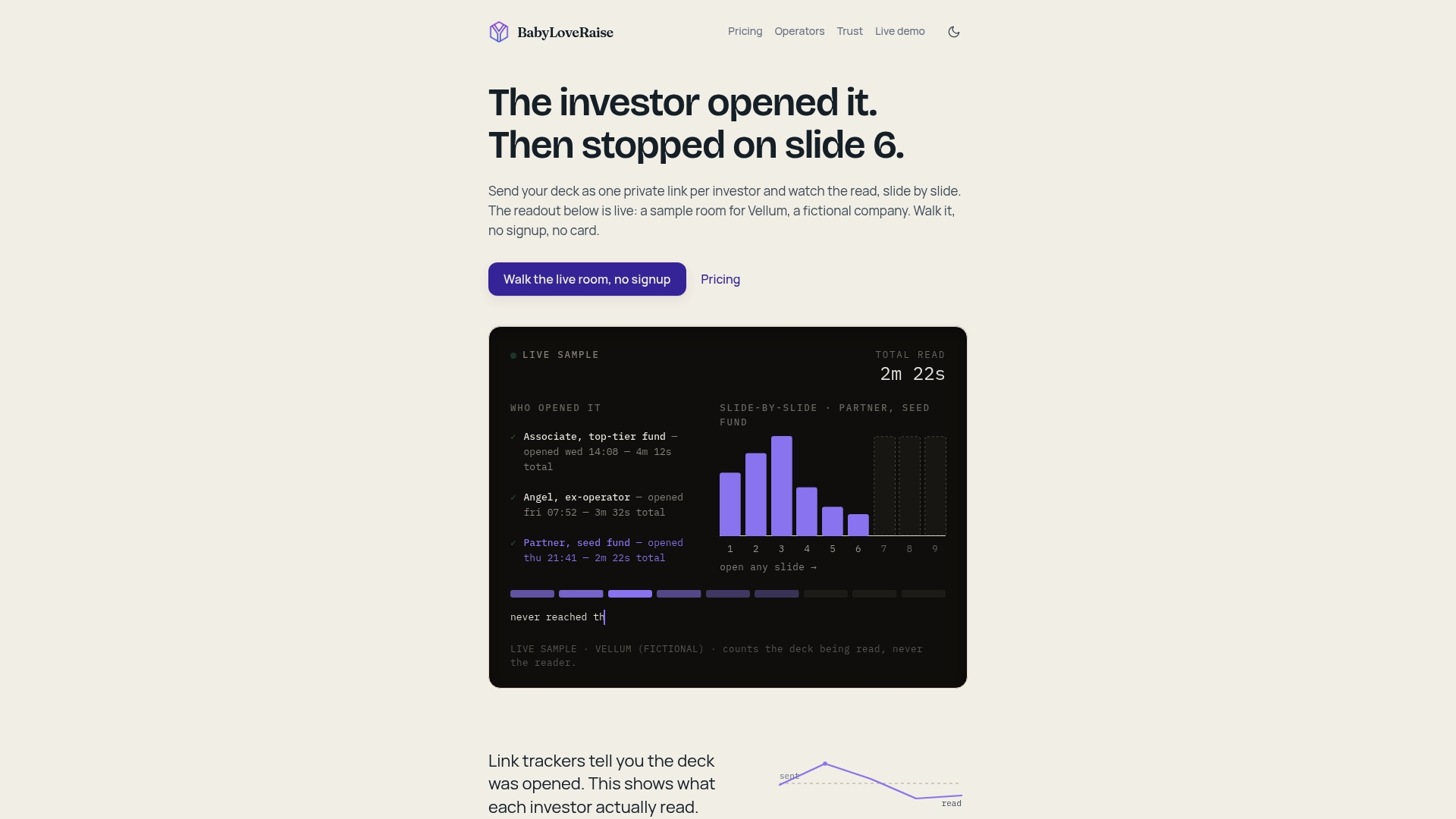
The raise room is priced per raise, not per seat forever, which means you’re not paying a monthly subscription between rounds. Share links come in three registers (first send, forwardable, private), downloads can carry a watermark, and when the raise closes the room converts to a permanent archive instead of disappearing behind a paywall. For founders who want hands-on help, editorial passes and narrative Build Map artifacts are available as add-ons. The analytics are document-level, not per-investor profiling, so you can be transparent with investors about how you track engagement.
Ready to send smarter and follow up with precision? See the raise room plans and create your first room today.
Sources and templates referenced in this guide
The resources below informed the frameworks and examples throughout this guide. Study them in the order that matches your current bottleneck: narrative first, then design, then GTM.
- Sequoia Capital pitch deck template: The canonical narrative sequence for investor decks. Use it to check your slide order and thesis clarity. Best studied for sequencing logic, not visual style.
- Y Combinator pitch deck guidance: YC’s emphasis on 5–7 ideas and legibility is the right constraint for demo day and early seed rounds. Use it when you’re cutting slides, not adding them.
- Slide Gamma storytelling frameworks: A breakdown of five narrative frameworks (PAS, Why-How-What, BAB, Hero’s Journey, YC memo) with examples. Use it when your narrative feels like a list of facts instead of an argument.
- VC Beast design guide: Practical design rules for grid systems, rule of thirds, and chart annotation. Use it when the deck looks cluttered or the argument isn’t obvious at a glance.
- GTM Strategist GTM slide guide: The clearest breakdown of what a GTM slide needs to show and how to present assumptions. Use it before you finalize your traction and GTM slides.
- Talk Pitch narrative arc guide: Explains the logic gap problem and how to close it. Use it when investors keep asking “why now?” or “why you?” after seeing the deck.
- Harvard Innovation Labs storytelling guide: Practical coaching on integrating personal narrative with data. Use it when your pitch is technically correct but not memorable.
- BabyLoveRaise pitch deck examples: Curated real-deck examples with commentary. Use it to extract three specific moves from funded decks and adapt them to your own.
When studying any example deck, extract three specific moves: a slide structure, a headline format, or a chart annotation technique. Adapt those moves to your own narrative. Copying the visual style without understanding the argument underneath produces a deck that looks right but doesn’t work.