
Founders: Use Timing Data to Cut Deck Length to Under 4 Minutes
Timing-first guide for founders. Trim your pitch so investors read it in under 4 minutes, using attention benchmarks and live engagement analytics to cut...
September 11, 2026 · 7 min read

Aim for a 10 to 12 slide core deck, readable in under four minutes on a first pass. For a 30-minute meeting, pitch for 15 to 20 minutes and leave the rest for questions, pushing every deep-dive chart, model, and reference slide into an appendix you pull up only when asked.
TL;DR:
- Investors typically spend under four minutes on a pitch deck, with 12 slides being the optimal number for engagement.
- The first three slides are critical filters, with team and traction slides receiving the most attention from investors.
- Each slide should effectively communicate one idea and be designed for quick skimming, with any slide taking over 30 seconds needing revision.
- Adjust slide count and content based on pitch length, from three slides for a three-minute pitch to the full 10-12 slides for a 20-minute presentation.
- Using engagement-tracking tools and an organized appendix helps refine the deck and prioritize slides that actually hold investor interest.
BabyLoveRaiseSee Which Slides Hold AttentionBabyLoveRaise shows who opened your deck, who reached the last slide, and where readers spent or lost attention.Explore BabyLoveRaise
Table of Contents
- Why deck length and timing shape investor attention
- The 10 to 12 slide blueprint that respects a first read
- How pitch length changes the deck
- Building an appendix that earns its keep
- Rehearsing and reading the engagement signals
- The timing mistake that sinks most decks
- How BabyLoveRaise helps you find the slides that lose investors
- Sources
Why deck length and timing shape investor attention
Investors spend an average of 3 minutes and 44 seconds reading a pitch deck the first time they open it. That is the entire window you have to land your story, which is why every slide needs one idea, stated once, without a rescue paragraph underneath it.
Data pulled from 24,541 decks puts the effective range at 9 to 16 slides, with 12 slides showing up repeatedly as the sweet spot for total views and return visits. Fewer slides than that and you are probably skipping context investors need. More, and you are diluting the slides that actually earn attention.
Those high-attention slides are predictable. Team and financials pull disproportionate reading time, and investors frequently use the first three slides as a filter before deciding whether to keep reading. That single fact should drive your whole slide order.
A few habits follow directly from this data:
- Send a link, not a PDF attachment, so you can see opens, reopens, and per-slide dwell time.
- Put your strongest proof point, usually traction, on slide 2 or 3, not buried on slide 9.
- Treat any slide that takes longer than expected to read as a writing problem, not a compliment.
- Design for skimming first. Investors who want depth will ask, or reopen the deck later.
The 10 to 12 slide blueprint that respects a first read
A pitch deck earns its slide count when each page carries exactly one job. Here is a sequence built around what actually gets read, not what feels complete to the founder writing it.
- Cover / one-liner. State what you do and for whom in one sentence. Budget: 10 to 15 seconds.
- Traction. Your best number, chart, or logo, right up front, because this is inside the filter window. Budget: 30 to 45 seconds.
- Problem. The pain, sized concretely, not abstractly. Budget: 20 to 30 seconds.
- Solution. What you built and why it solves that problem better than the status quo. Budget: 30 to 45 seconds.
- Market. Realistic sizing with a source, not a vague total-addressable-market claim. Budget: 20 to 30 seconds.
- Business model. How money moves from customer to you. Budget: 20 to 30 seconds.
- Go-to-market detail. How you actually acquire customers today, with evidence. Budget: 30 to 45 seconds.
- Competition / positioning. Why you win, framed against real alternatives. Budget: 20 to 30 seconds.
- Team. Backgrounds that make this team credible for this specific problem. Budget: 30 to 45 seconds.
- Financials / the ask. What you are raising, the plan for it, and the runway it buys. Budget: 45 to 60 seconds.
Statistic Callout: Investors treat the first three slides as a screening filter, and across large decked samples, 12 slides is the recurring sweet spot for total engagement. Miss the first three, and the other nine rarely matter.
The editing rule is simple: if a slide takes more than 30 seconds to parse on a cold first read, it needs a rewrite or a move to the appendix. That is usually a sign of two ideas fighting for one slide, not a sign the topic deserves more room. The BabyLoveRaise slide order guide walks through variations on this sequence if your business model needs a different emphasis.

How pitch length changes the deck
The 10 to 12 slide core deck flexes depending on how much time you actually get in the room.
- A 3-minute pitch (demo day, elevator setting): cut to 3 to 5 slides, 15 to 20 seconds each. Cover the problem, the solution, and one traction hook. Nothing else survives the cut.
- A 7-minute pitch: 7 to 10 slides with a tighter narrative arc and exactly one strong evidence slide, usually traction or a customer proof point, that does the heavy lifting.
- A 20-minute pitch inside a 30-minute first call: use the full 10 to 12 slide core deck, but pitch for 15 to 20 minutes and leave 10 to 15 minutes for questions. That ratio is non-negotiable if you want the meeting to feel like a conversation instead of a lecture.
For early calls, a pre-recorded 90-second demo beats a live one. Screen shares glitch, apps crash, and a recorded clip protects your pacing no matter what the investor’s Wi-Fi does that day.
Building an appendix that earns its keep
Everything that does not survive the core deck’s editing rule belongs in an appendix, not the trash. A well-built appendix runs 10 to 20 or more slides and covers the material investors ask about once they are already interested: financial model detail, KPI trends, unit economics, cohort charts, customer references, and roadmap milestones.
Inside that larger appendix, keep a five-slide rapid-response set for live Q&A. This should be your fastest answers to the questions you get asked most: burn and runway, top three metrics, customer concentration, competitive moat detail, and use of funds. Organize both sets by topic, not by creation date, so you can jump straight to the answer without flipping past six unrelated slides. The BabyLoveRaise appendix guide covers version control for keeping these current as your metrics change.
Pro Tip: Label appendix slides with a topic tag in the corner, like “Unit Economics” or “Roadmap,” so you can navigate by voice command during a call instead of hunting through 20 slides while an investor waits.

Rehearsing and reading the engagement signals
Time yourself with a stopwatch on a full run, then record video of that run and map your actual seconds per slide. Fix whichever slide ran longest first. Long dwell time on a slide usually means the writing is confusing, not that the content is compelling, so treat every slow slide as a rewrite candidate rather than a win.
Once the deck is live, track engagement instead of guessing:
- First open and time to first open can indicate whether an investor is even looking yet.
- Seconds per slide can show which pages hold attention and which get skimmed.
- A second open, days or weeks later, may signal growing interest.
- Downloads may suggest internal sharing of the deck.
Using tools with view-only links, forwarding controls, and watermarks can help distinguish between “never opened it” and “read every slide and passed,” enabling better-informed follow-ups and deck revisions.
The timing mistake that sinks most decks
The single biggest error founders make is not slide count. It is refusing to cut. Founders write a deck as a complete brief instead of a conversation starter, then wonder why investors stop reading around slide 6. Every slide you add past the point of clarity is a slide fighting your traction slide for attention it will not get.
Before you send anything, run this checklist:
- Time a full run with a stopwatch.
- Confirm your traction proof sits on slide 2 or 3.
- Confirm the team slide includes LinkedIn links investors can actually click.
- Confirm financials and the ask appear before the deck ends.
- Build a five-slide rapid-response appendix.
- Set the share link to view-only before it leaves your inbox.
— Paul
How BabyLoveRaise helps you find the slides that lose investors
BabyLoveRaise replaces the guessing game with a hosted raise room that shows exactly which slides hold attention and which get skimmed, so you can trim a bloated deck based on real behavior instead of a hunch.
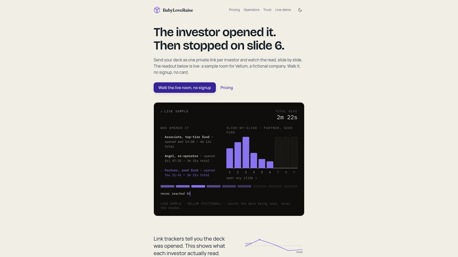
Rooms can notify the moment someone opens the deck and track per-slide engagement, who reached the last slide, and who stalled on certain slides. This distinguishes “never opened it” from “read the whole thing and passed,” allowing for different follow-ups. Share links can have different permissions, and downloads may include watermarks. Advisory firms running multiple client raises may have options to maintain brand consistency. If your deck has been sitting at 20 slides with no real feedback on why it stalls, check the BabyLoveRaise raise room and see which slides are actually costing you attention.
Sources
- What Investors Actually Read in Your Pitch Deck (DocSend Data) - PitchGrade
- How Investors Read Pitch Decks — Data from 24,541 Decks
- Seed round fundraising tips to make your pitch deck a hit with VC investors — Fenwick
- Pitch Deck Timing Guide: Master Your Seed Round Pitch