
The Investor-Focused Pitch Deck Slide Order That Works
Discover the effective pitch deck slide order that helps secure seed funding. Learn to craft a compelling narrative in only 12 slides.
August 13, 2026 · 15 min read

The recommended pitch deck slide order for seed fundraising is: Cover → Problem → Market → Solution → Product → Traction → Business Model → Go-to-Market → Competition → Team → Ask → Financials, with an appendix for depth. Keep the main deck to 10–14 slides for a send-ahead and 10–12 for a live seed pitch. That sequence is not arbitrary — it mirrors how investors triage and decide.
Quick reference for slide count and time:
- 10–12 slides for a live seed pitch (15–20 minutes of content, leaving room for Q&A)
- 10–14 slides for a send-ahead deck, with appendix slides attached
- 1–2 minutes per slide as a live pacing target
- Appendix for cohort data, unit economics, and detailed financials — not in the main deck
The 12-slide seed structure has become the practical standard in 2026, validated across multiple funded rounds. If you can tell your story in 12 clean slides, you probably understand your business well enough to raise.
Key Takeaways
The most effective pitch deck slide order puts the problem before the solution, pulls your strongest signal to the first three slides, and keeps the main deck inside 10–14 slides with an appendix for depth.
| Point | Details |
|---|---|
| Recommended slide order | Cover → Problem → Market → Solution → Product → Traction → Business Model → GTM → Competition → Team → Ask → Financials |
| Slide count by format | 10–12 slides for a live seed pitch; 10–14 for a send-ahead deck with appendix attached |
| Stage emphasis | Pre-seed leads with team; seed pulls traction to slide 2 or 3 if the metric is strong; Series A expands GTM and unit economics |
| Appendix discipline | Cohort curves, full financial models, and roadmaps belong in the appendix — never in the main deck |
| BabyLoveRaise | Per-slide engagement analytics show exactly where investor attention drops so you can iterate the sequence with real data |
Table of Contents
- Why pitch deck slide order matters more than you think
- What each slide in the sequence must actually say
- How the slide order shifts by stage and delivery format
- Concrete dos and don’ts before you send the deck
- What public seed decks actually teach you
- How to use per-slide engagement to iterate your deck order
- What belongs in the appendix and how to label it
- The slide order mistake most founders make
- BabyLoveRaise turns investor silence into a signal you can act on
- Sources
Why pitch deck slide order matters more than you think
Investors do not read decks the way you wrote them. A VC partner doing a first-pass review spends a median of about 3 minutes 44 seconds on a deck before deciding whether to pass or dig deeper. That is not a reading session — it is a triage scan.
VCs typically flip to team, traction, or the ask during that first pass, not the cover. So each slide has to answer its core question when read in isolation. A traction slide that buries the headline number in the third paragraph fails even if the number is great. A team slide that leads with advisor logos instead of founder credentials fails even if the founders are exceptional.
The problem-before-solution sequence matters for a specific reason: investors need to feel the pain before they can evaluate the cure. If you show your solution first, they spend the next three slides mentally constructing the problem themselves — and they usually get it wrong. Putting market size before product works the same way: it frames the opportunity before you ask them to evaluate your specific approach to it.
Common failures when the order is wrong:
- Burying the ask at the end with no financial context nearby, forcing investors to flip back and forth
- Leading with product before establishing why the problem exists or how large the market is
- Financials appearing cold, disconnected from the ask slide they should support
- Traction hidden mid-deck, when a strong metric on slide 3 would have kept the investor reading
- Competition slide placed too early, before the investor understands what you actually do
When the deck follows the expected spine, investors can follow faster because they know where to look. Cognitive friction drops. That is not a small thing when you have 3 minutes and 44 seconds.
What each slide in the sequence must actually say
Every slide in your deck needs to work as a standalone answer. Here is the slot-by-slot breakdown, with the minimum each slide must contain and the single most common mistake per slot.
| Slide | Headline to put at the top | Must-have element | What to avoid |
|---|---|---|---|
| Cover | One-line company description + category | Company name, tagline, contact | Cluttered logos, no tagline |
| Problem | “X% of [audience] struggle with [pain]” | Quantified pain point | Vague “the market is broken” framing |
| Market | “$X billion TAM, $Y billion SOM” | Bottom-up SOM math | Top-down TAM with no SOM |
| Solution | One sentence: what you do and for whom | Clear contrast with status quo | Feature list before benefit |
| Product | One screenshot or demo frame | Single UI moment, not a tour | Multiple screenshots, no context |
| Traction | Headline metric in large type | MoM growth rate or revenue | Vanity metrics (downloads, signups without activation) |
| Business Model | “We charge $X per [unit] to [customer]” | Unit economics or LTV/CAC | Vague “freemium + enterprise” without numbers |
| Go-to-Market | First channel + CAC target | Acquisition channel and cost | “We’ll use social media and SEO” |
| Competition | Positioning map or 2x2 | Your differentiated position | “We have no competitors” |
| Team | Founder-market fit in one line per founder | Relevant prior experience | Long advisor lists, irrelevant credentials |
| Ask | “$X for Y months of runway” | Use of funds breakdown | Round size with no use of funds |
| Financials | 3-year revenue projection + key assumptions | Revenue, burn, path to profitability | Spreadsheet screenshots |
A few visual rules that apply across every slide:
- Minimum 30pt font for body text in live presentations (Guy Kawasaki’s 10/20/30 rule still holds for live pitches)
- One idea per slide, full stop
- Headline at the top states the conclusion, not the topic (“Revenue grew 3x YoY” not “Revenue”)
- White space is not wasted space — a crowded slide signals unclear thinking
Pro Tip: Put your traction headline in the largest type on that slide, not in a chart legend. Investors flipping to traction should read the number before they read anything else. If the number is strong, that one choice keeps them in the deck.
For a deeper look at what each slide should contain, the pitch deck content guide covers slot-level specifics with sample copy.
How the slide order shifts by stage and delivery format
The 12-slide sequence above is a starting point, not a fixed rule. Stage and delivery mode both change which slides deserve more real estate and where you should move strong evidence.
What investors expect by stage:
- Pre-seed: Team and insight carry the most weight. You likely have no traction, so the team slide and the problem framing do the heavy lifting. Move team earlier — slide 3 or 4 — if your founder-market fit is the strongest signal you have.
- Seed: Traction plus team. At seed, the team slide carries outsized weight — investors want founder-market fit and execution capability, not a long advisor list. But if you have a strong traction metric, pull it to slide 3 as a hook before the full narrative.
- Series A: Growth metrics, unit economics, and GTM depth. Financials move into the main deck (not just the appendix), and the go-to-market slide expands to show channel-level data and CAC by cohort.
Three common sequence variations:
- Founder-led pre-seed (no traction): Cover → Problem → Team → Market → Solution → Product → Business Model → Go-to-Market → Competition → Ask → Financials
- Traction-first seed: Cover → Traction (headline metric) → Problem → Market → Solution → Product → Business Model → Go-to-Market → Competition → Team → Ask → Financials
- Data-heavy Series A send-ahead: Cover → Problem → Market → Solution → Traction → Unit Economics → Business Model → Go-to-Market → Competition → Team → Ask → Financials → Appendix (cohort curves, CAC detail, roadmap)
The core principle: pull your strongest signal earlier. If traction is your best card, play it on slide 2 or 3. If team is your best card, do the same. Investors who hit a compelling signal early read more carefully.
For send-ahead decks, you have more room — 10–15 slides is the standard range, with appendix material attached. For live pitches, cut to the bone. Every slide you add is a minute you are not spending on Q&A.
Concrete dos and don’ts before you send the deck
Most slide-order problems are actually slide-content problems in disguise. A weak traction slide does not need to move — it needs a better headline. Here is what to fix first.
Do:
- Write every slide headline as a complete sentence that states the conclusion (“We grew from $0 to $400K ARR in 18 months” not “Revenue Growth”)
- Put the single most important number on the traction slide in the largest type on the page
- Include one line of founder-market fit evidence per founder on the team slide (“Built and sold a logistics company serving 200 carriers” beats “10 years in operations”)
- Use bottom-up SOM math on the market slide — show how you get to your number, not just what it is
- Keep the ask and financials adjacent so investors never have to flip between them
Don’t:
- Fill slides with bullet points — three bullets of 10 words each beats eight bullets of 30 words each
- Inflate TAM without showing SOM math — a $500B TAM with no SOM calculation signals you have not thought through distribution
- Use a competition quadrant where you win every axis — investors read those as a sign the founder has not done the research
- Put the ask on the last slide with no financial context nearby
- Include a “roadmap” slide in the main deck — it belongs in the appendix
Before/after fixes:
Weak: “Our platform helps companies manage their data more efficiently.”
Weak: Competition slide with a 2x2 where your dot sits in the top-right corner alone. Fixed: Competition slide that names two or three real alternatives, states what they do well, and explains the specific gap you fill.
Pro Tip: If your deck is over 14 slides, do not cut content — move it. Cohort curves, detailed financial models, product roadmaps, and technical architecture all belong in the appendix. The main deck is the argument; the appendix is the evidence room.
For practical editing techniques that sharpen individual slides, the startup presentation refinement guide covers visual hierarchy and copy brevity in detail.
What public seed decks actually teach you
The Airbnb, Uber, YouTube, and Buffer seed decks are the most studied examples in startup fundraising. Each one teaches a specific lesson about slide order and slot-level choices.
- Airbnb (2009): The deck’s cover slide stated the concept in a single line — “Book rooms with locals, rather than hotels.” Problem and solution came immediately after, before any market sizing. The lesson: clarity of concept on slide 1 earns the investor’s attention for everything that follows. Copy the one-line cover framing.
- Uber (2008): An early Uber deck ran long by modern standards, with detailed market analysis early in the sequence. The takeaway for founders today is the opposite of what made it work then — the market context was compelling, but the deck’s length would not survive a 2026 first-pass review. Keep the market slide tight; move depth to the appendix.
- YouTube (2005): The YouTube deck led with the problem framing before showing any product, which kept the investor focused on the pain rather than the interface. One product screenshot, not a feature tour. That single-screenshot discipline is worth copying directly.
- Buffer (2011): Buffer’s deck included transparent revenue and user metrics early, which was unusual at the time. The traction slide carried a specific number in the headline position. The lesson: if you have real metrics, put them where they cannot be missed. Buffer’s transparency also extended to the business model slide, which showed actual pricing tiers rather than vague “freemium” language.
Teardowns of funded seed decks consistently show three repeatable patterns: one screenshot on product slides, a headline traction number in large type, and bottom-up SOM math on the market slide. Those three choices show up across decks that closed rounds. The YC seed-deck template — title, problem, solution, traction, product, business model, market, team, ask — reflects the same logic in a slightly compressed form.
How to use per-slide engagement to iterate your deck order
Sending the deck and waiting is the worst possible feedback loop. You get a yes, a no, or silence — and silence tells you nothing about whether the problem was slide 3 or slide 9. Per-slide engagement data changes that.
Here is a practical workflow for testing and iterating your slide sequence:
- Baseline send. Send your current deck to a small group of investors (5–10) using a tracked link. Record which slides each investor reached and how long they spent per slide.
- Identify the drop-off point. Find the slide where most investors stopped reading. That slide is either weak on its own or is in the wrong position — the narrative broke before it.
- Form one hypothesis. If investors are dropping off at the product slide, test whether moving traction earlier (before product) keeps them reading longer. Change one variable at a time.
- Run the A/B order. Send the revised sequence to the next group. Use a separate tracked link so you can compare read-to-end rates between the two versions.
- Evaluate with four metrics: per-slide dwell time, slide skip rate (slides viewed for under 5 seconds), read-to-end percentage, and follow-up conversion rate (investors who read to the end and then replied or took a meeting).
- Act on the data. If dwell time on the traction slide doubled after moving it earlier, keep the change. If the product slide still has a high skip rate, shorten it or replace the screenshot.
Key metrics to track:
- Per-slide dwell time: how long an investor spent on each slide
- Slide skip rate: slides viewed for under 5 seconds, a signal the slide is not landing
- Read-to-end %: the share of investors who reached the last main-deck slide
- Follow-up conversion rate: investors who read to the end and then took a next step
Pro Tip: Your first hypothesis should target the slide immediately before your biggest drop-off point, not the drop-off slide itself. Investors usually leave because the previous slide did not give them a reason to continue — the exit happens one slide late.
BabyLoveRaise’s pitch deck analytics guide explains which engagement signals matter most and how to act on them between investor conversations.
What belongs in the appendix and how to label it
The appendix is not a dumping ground. It is a precision tool. Investors who want depth will look for it; investors who do not will never see it. The goal is to keep the main deck clean while making the supporting data easy to find.
Appendix content that belongs out of the main deck:
- Cohort retention curves (monthly or weekly, by acquisition cohort)
- Full unit economics breakdown (LTV, CAC by channel, payback period)
- Detailed 3-year financial model (monthly for year 1, quarterly for years 2–3)
- Product roadmap (quarterly milestones, feature prioritization rationale)
- Legal and IP details (patent filings, key contracts, regulatory status)
- Technical architecture (for deep-tech or infrastructure companies)
- Customer reference list (names and contact info for reference calls)
Naming convention: Label each appendix slide with a number and a short, specific title. “Appendix A: Monthly Cohort Retention” is findable. “Additional Data” is not. Keep titles under six words.
For send-ahead decks, include the full appendix as part of the PDF or shared link — investors doing diligence will want it. For live pitches, keep the appendix in a separate file or data room and reference it verbally: “I have cohort data in the appendix if you want to dig into retention after this.” That line signals you have the data without cluttering the live presentation.
Headline financials belong adjacent to the ask in the main deck; the detailed model lives in the appendix. Never put a spreadsheet screenshot in the main deck.
The slide order mistake most founders make
Most founders treat the team slide as a résumé. They list titles, logos from previous employers, and a row of advisor headshots. That is the wrong frame entirely.
At seed, investors are not evaluating credentials — they are evaluating whether this specific team can execute this specific idea. Founder-market fit is the question. “Why are you the right people to solve this problem?” is what the team slide has to answer, not “What impressive things have you done in general?” A founder who spent eight years in the industry they are now disrupting needs one sentence that says exactly that. An advisor list does not answer the question.
The traction slide gets the same misuse. Founders put downloads, signups, or social followers on it because those numbers are large. Investors read those as vanity metrics and move on. The traction slide should show the metric that proves the business is working: revenue, active paying customers, MoM growth rate, or retention. One number, large type, with a short trend line.

Here is a simple test you can run in 48–72 hours: swap the order of your traction and product slides and send the revised deck to a small group of investors. Measure read-to-end rate for both versions. If the traction-first version keeps more investors reading through to the ask, you have your answer. If it does not, the traction slide itself needs work before the order matters.
The best pitch decks are not written once. They are iterated based on what the data shows, not what the founder believes should be compelling. Fix the deck based on what investors actually do with it.
BabyLoveRaise turns investor silence into a signal you can act on
Most founders send a deck and wait. Two days later, silence. The problem is that “never opened it” and “read every slide and passed” look identical from the outside — both are just no reply.
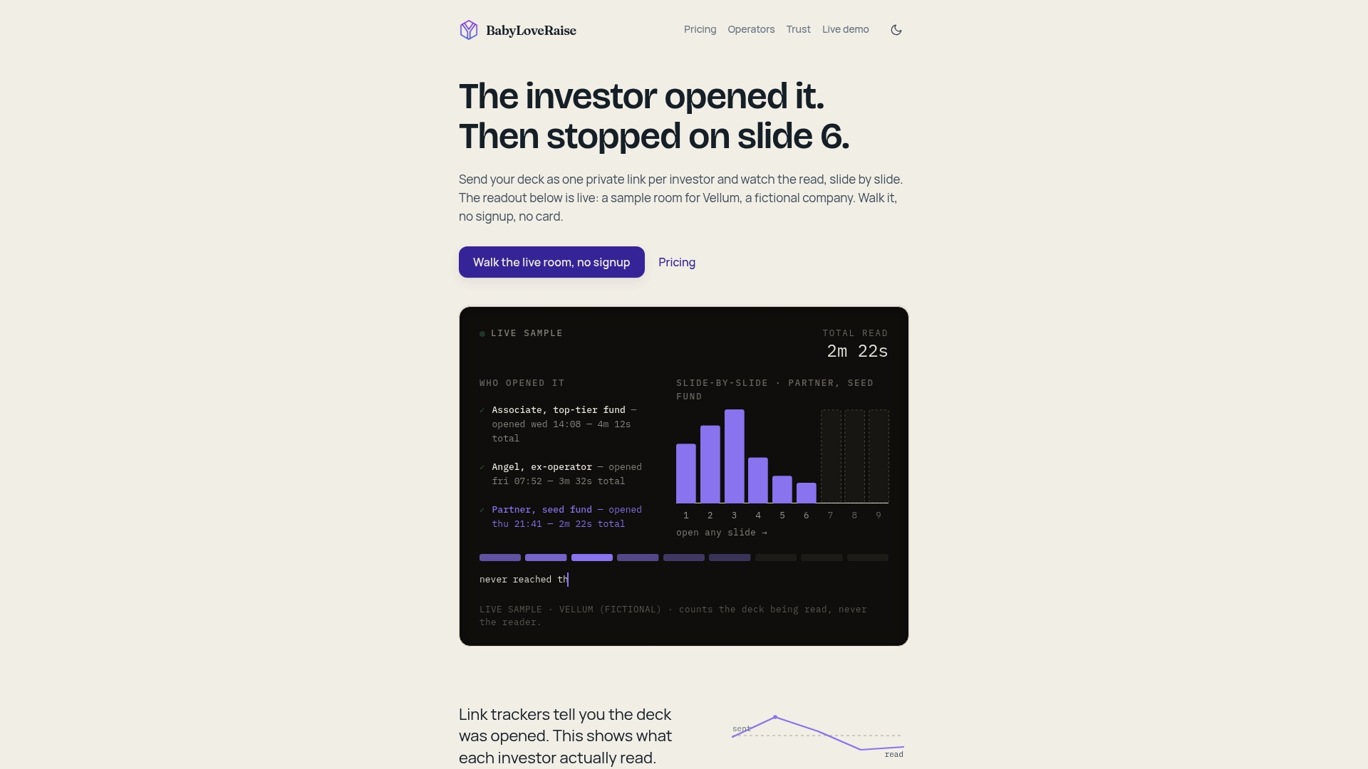
BabyLoveRaise gives you a hosted raise room where each investor gets a tracked link. The moment they open the deck, you know. Per-slide dwell time shows you exactly where attention held and where it dropped. If investors consistently leave at slide 6, that is not a coincidence — that slide is the problem, and now you know which one to fix. Unlike generic document trackers built for sales teams, BabyLoveRaise is built around the raise itself: first-read notifications, a target list of which investors finished the deck, and tiered share links (first send, forwardable, private) so you control how the deck travels. When the raise closes, the room converts to a permanent archive rather than locking you out.
Open your raise room at BabyLoveRaise and start measuring which slides are actually working.
Sources
These are the canonical references worth bookmarking before you finalize your deck:
- Seed funding pitch deck guidance — CRV
- The 12-slide seed pitch deck: 5 real teardowns (2026) | Causo Hub
- How to Structure a Pitch Deck: The 11 Slides Investors Expect in 2026 | VisualHackers
- Investor Pitch Deck Slide Order: The VC Reading Pattern — Winning Presentations
- How to build your seed round pitch deck — Y Combinator