
Pitch Deck Redesign Checklist: 25 Checks Before You Rework Slides
A pitch deck redesign checklist for founders: audit story, slides, numbers and send settings, then use per-slide reader data to fix what actually lost investors.
November 3, 2026 · 11 min read

If you searched for a deck redesign checklist because your pitch deck is not getting meetings, start here: audit before you redesign. Most founders restyle slides when the real problem is one weak slide, a missing answer, or a send that nobody finished reading. The checklist below runs in four passes (evidence, story, slides, send) so you change only what the evidence says is broken.
One note on scope: this is for pitch decks that founders send to investors. If you meant the wooden kind in a backyard, that is a different checklist, and nothing here will help with joists.
BabyLoveRaisebabyloveraise.comRedesign the Slides Readers LeaveBabyLoveRaise shows which investors opened your deck, how far they read, and which slides held their attention.Explore BabyLoveRaiseTL;DR
- Diagnose first. Separate “never opened” from “opened and skimmed” from “read it all and passed”, because each needs a different fix.
- Redesign the slides where attention dropped, not the whole deck. Per-slide dwell and drop-off point to them.
- Check story order, one claim per slide, numbers that agree with each other, and a clear ask.
- Test one change at a time against a fresh batch of investors, and keep a version log.
- Lock down the send (link type, watermark, forwarding) before the new version goes out.
Table of Contents
- Why audit before you redesign
- Pass 1: Gather the evidence
- Pass 2: Audit the story
- Pass 3: Audit the slides
- Pass 4: Audit the send
- How to test the redesign
- Perspective
- Common mistakes in deck redesigns
- A one-page version you can copy
- Get reader data on your next version
- FAQ
- Sources
Why audit before you redesign
A redesign feels productive. You get new fonts, new charts, a cleaner template. But a deck that fails for structural reasons will fail again in a nicer layout.
The trouble is that a silent inbox looks the same whatever the cause. An investor who never opened the PDF, one who bailed on slide 4, and one who read every slide and decided it was not a fit all produce the same result: no reply. If you only have a PDF attachment or a bare file link, you cannot tell them apart, so you guess, and the guess usually becomes “the design must be bad.”
So the first pass of any redesign is to find out which of three situations you are in:
- Nobody is opening it. The problem is the subject line, the intro, the warm path or the list, not the deck.
- People open it and leave early. The problem is in the first slides, or in a specific slide where attention drops.
- People finish it and still pass. The problem is the business, the terms, the stage fit or the missing proof. Design will not fix it.
Only the second situation is a true redesign job, and even then it is usually a repair of two or three slides.
Pass 1: Gather the evidence
Before you open your design tool, collect what you already know. This pass takes an hour and saves days.
- [ ] List every investor you sent the deck to, with the date, the version and how you sent it.
- [ ] Mark each one as opened, finished or not opened. If you cannot, that is your first finding: your current sending method gives you no reader data. A hosted room that notifies you on first read and records per-slide engagement fixes that going forward. Our guide on how to track deck completion during a fundraise shows what to record.
- [ ] Find the slide where attention died. Look for the slide where the most readers stopped, or where dwell time spikes (confusion) or collapses (skimming).
- [ ] Write down every question investors asked in calls that the deck should have answered. Repeated questions are missing slides.
- [ ] Note the replies that mention the deck itself, such as “couldn’t tell what the product does” or “market size seemed inflated.”
- [ ] Save the current version untouched. You need a baseline to compare against.
When you have this, you can set the scope of the redesign the way a good product team would: diagnose, decide what is in and out, then change it. The same discipline applies to any analytics-heavy interface, and a dashboard redesign guide on diagnosis, scope and migration lays it out well if you are reworking how you read your own numbers.
Pass 2: Audit the story
Story problems hide behind design problems. Check these before touching a single slide.
- [ ] One-sentence test. Can someone who has only read slide 1 and slide 2 say what you do, for whom, and why now? If not, rewrite those two slides first.
- [ ] Problem before product. The reader should feel the problem before seeing your solution. If your product shows up on slide 2 with no pain established, reorder.
- [ ] Order of proof. Traction, customers or early signals should appear before you ask the reader to believe a large market. Pre-seed investors in particular are reading for evidence that something is already working.
- [ ] Why you. Is there a slide or a line that says why your team is the one to build this? Solo founders often skip it, because it feels awkward.
- [ ] The ask. State the amount, the instrument if you are comfortable doing so, and what the money buys over the next 12 to 18 months. A deck that ends on “thank you” wastes its most-read position.
- [ ] Cut anything that answers a question nobody asked. Every slide should earn its place by moving the reader toward a meeting.
If you need the full build rather than a repair, our walkthrough on how to build a pitch deck for investors covers the structure from scratch.
Pass 3: Audit the slides
Now, slide by slide. Work through this list for each one, and mark the slide as keep, fix or cut.
- [ ] One claim per slide. The headline should state the point, not label the topic. “Revenue” is a label. “Revenue grew every month since launch” is a claim, if it is true.
- [ ] Readable at a glance. Imagine it on a phone screen, because that is where many first reads happen. Body text that needs zooming is too small.
- [ ] Charts carry a single message. Remove gridlines, extra series and decorative effects. Label the axis with units and the time period.
- [ ] Numbers agree everywhere. Check that revenue, growth rate, user counts and runway on the traction slide match the financial slide and the ask. Mismatches cost more trust than ugly design.
- [ ] Sources and dates on every external figure. If you cite a market size, say where it comes from and when. Investors check.
- [ ] No walls of text. If a slide needs a paragraph, it is a memo page, and probably belongs in a follow-up document rather than the deck.
- [ ] Consistent visual system. Same fonts, colors, margins and chart styles throughout. Consistency reads as competence.
- [ ] Screenshots are real and legible. A product screenshot should show the one thing you want the reader to notice. Crop to it.
- [ ] Slide count and read time. Long decks lose readers. Our piece on using timing data to cut deck length to under 4 minutes shows how to decide what goes.
A worked example
Say your room shows eleven investors opened the deck, nine reached slide 5, and only three reached slide 9. Slide 6 has very short dwell time while slide 7 has a long one.

That pattern suggests slide 6 is being skimmed (probably a dense or generic slide) and slide 7 is confusing readers (they linger because they are trying to work it out). The redesign scope is two slides: simplify 7, and either sharpen or cut 6. You leave slides 1 to 5 alone because they are doing their job. That is a two-hour fix, not a two-week redesign.
Pass 4: Audit the send
A better deck sent badly still underperforms. Check the delivery.
- [ ] Choose the right link type for each recipient. A first send, a link you expect to be forwarded to a partner, and a private link for a sensitive investor are three different situations. Our guide to private pitch deck links explains when each fits.
- [ ] Decide on downloads. If investors can download, consider a measured watermark so a leaked copy can be traced. See traceable deck watermarks for what records to keep.
- [ ] Think through screenshots. You cannot stop every capture, but you can decide what to expose. Our note on preventing deck screenshots covers the realistic options.
- [ ] Keep sensitive detail out of the deck. Cap table specifics, customer contracts and detailed financials belong in a later-stage room, not the first-send deck. The difference is covered in data room vs deck for founders.
- [ ] Set up first-read notification. The best moment to follow up is soon after someone opens the deck, while it is fresh.
- [ ] Version your links. When you send the redesigned deck, send it as a new version, so you can tell which readers saw which one.
How to test the redesign
A redesign is a hypothesis. Treat it as one.
- Change one thing at a time where you can. If you rewrite the story, restyle the slides and reorder everything at once, you will not know what helped.
- Send the new version to a fresh batch. Do not resend to investors who already passed. Use new names so the comparison is fair.
- Compare like with like. Look at completion rate, the slide where readers stop, and the reply rate. Small batches are noisy, so look for big shifts, not tiny ones.
- Keep the log. Version, date, what changed, who received it, what happened. Our guide on running four pitch deck tests in one sitting shows how to set this up with per-slide data.
- Stop when it works. If completion goes up and meetings follow, resist the urge to keep tinkering. Spend that time on the pipeline.
Perspective
We built BabyLoveRaise around one observation: founders redesign decks in the dark. A solo founder has no cofounder to watch an investor read the deck and say “they lost interest on slide six.” The deck goes out as a PDF or a file link, the replies are silence, and two very different outcomes, “never opened it” and “read everything and passed,” look exactly the same.
That is why we think the audit comes before the design. Per-slide dwell is the closest thing a solo founder can get to a second reader, and it turns “make it prettier” into “fix slide 7.” We also think it should report on the document, never surveil the person: you learn how the deck performed, not who someone is.
It is also why we price per raise, not per seat forever, and why the room becomes a free permanent archive when your raise closes. The point is to help you raise, not to hold your history hostage afterward.
Paul
Common mistakes in deck redesigns
- Redesigning before reading the data. You fix what you can see, not what is broken.
- Adding slides to answer objections. Answer the repeated objection in one line on the slide where it arises. Do not append an appendix to the main deck.
- Changing the numbers while changing the design. Keep a single source of truth for your figures, and update every slide from it.
- Chasing a template. A trendy template does not fix an unclear story.
- Sending the new version to everyone at once. Hold some investors back so you can compare results.
- Forgetting the follow-up. A better deck only helps when you contact people who actually read it. Our checklist on turning deck views into meetings covers the follow-up routine.
A one-page version you can copy
| Pass | Question | Done when |
|---|---|---|
| Evidence | Who opened, who finished, where did readers stop? | You can name the weakest slides |
| Story | Can slides 1 and 2 explain the business? | A stranger can repeat it back |
| Slides | Does each slide make one claim, and do numbers agree? | Every slide is marked keep, fix or cut |
| Send | Is the link type, watermark and notification set? | New version is live as a separate version |
| Test | Did completion and replies improve on a fresh batch? | You have a log and a decision |
Get reader data on your next version
If you are about to rework your deck, the most useful thing you can add is visibility. Our raise room gives you one link to send, a notification on first read, and per-slide engagement so you can see which slides held attention and which were skimmed. The raise room is $149 per month or $399 per quarter, with the full details on our pricing page. When the raise closes, the room becomes a free permanent archive.
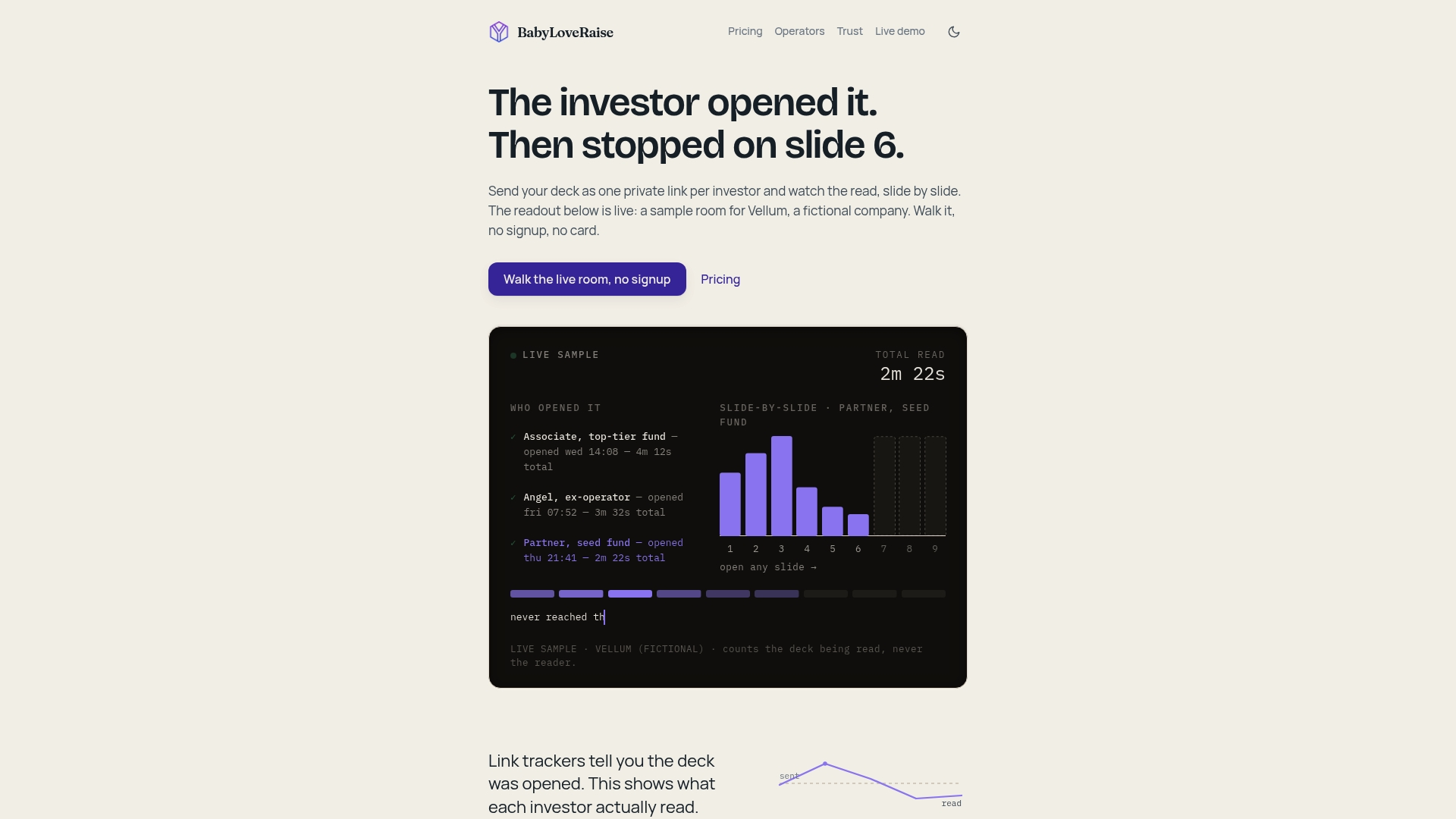
If you would rather have a person look at the story, we also offer an editorial pass, and firms running several client raises can look at our Operator plans.
FAQ
How many slides should I redesign at once?
Only the ones your data flags. If readers stop at one or two slides, start there and leave the rest alone. A full rebuild makes sense only when the story itself is wrong, for example when readers across the board fail to understand what you do.
What is the difference between a deck audit and a deck redesign?
An audit finds out what is wrong: who read, where they stopped, which questions keep coming up. A redesign changes the slides. Doing the audit first keeps you from spending time on visuals when the problem is the story, the list or the send.
How do I know if the problem is the deck or the investor list?
Check opens first. If few people open the deck, the issue is the intro, the warm path or the list. If many open it and finish but pass, the issue is fit or substance. If many open and leave early, the deck is the problem.
Should I send the redesigned deck to investors who already saw the old one?
Usually not, unless you have new news to share such as traction or a signed customer. Send the new version to a fresh batch so you can compare results fairly, and keep earlier readers for a genuine update.